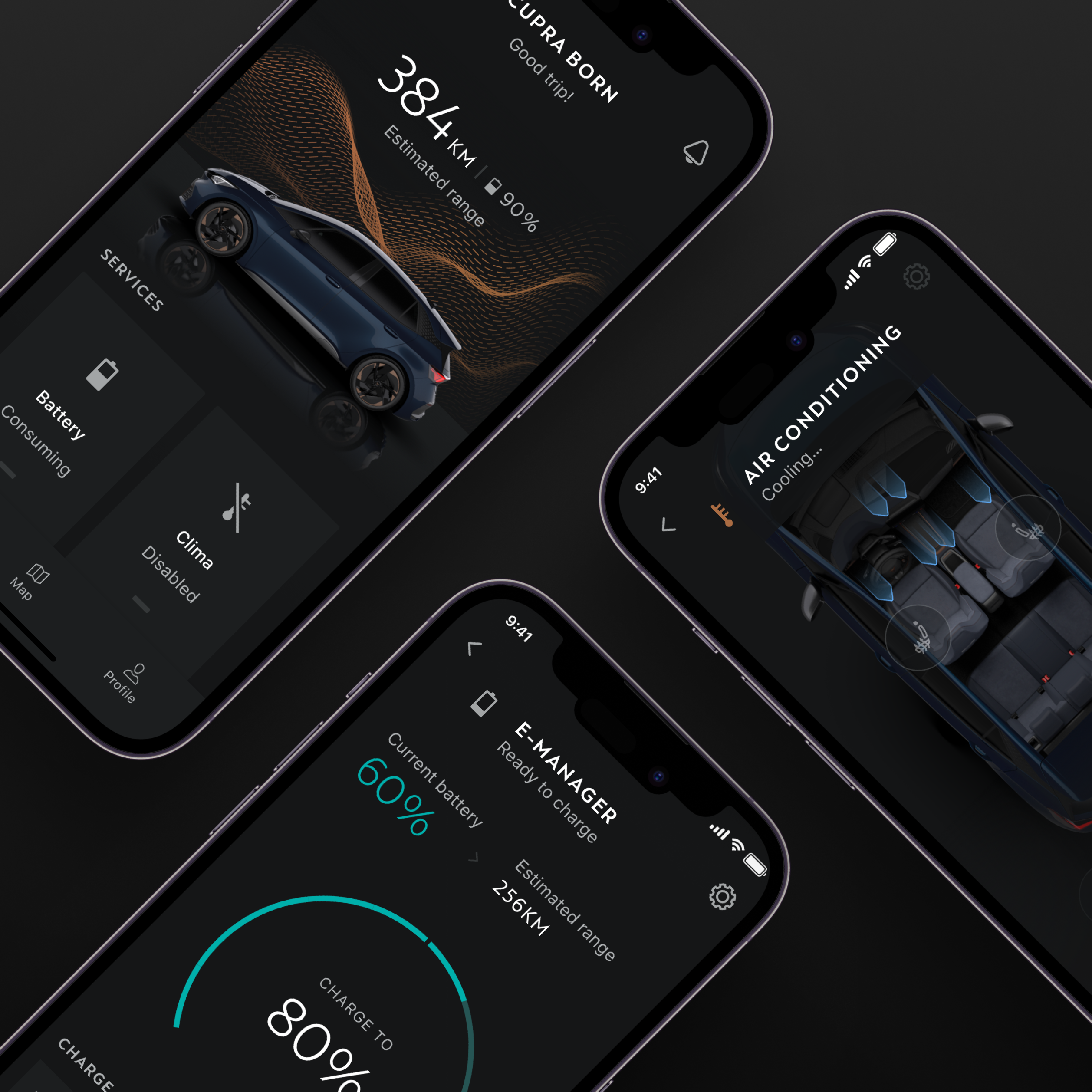
For the CUPRA automotive brand, I worked on the Design System for their new app. The objective was to create a scalable design system looking for consistency with other platforms (in-car screens, website), considering multi-brand customization.
SEAT and CUPRA brands have many digital platforms and services (apps, commercial websites, user portals, HMI In-Car platforms) without consistency in brand guidelines or user experiences.
The way of designing was more focused on contexts of use and not on transversal componentized elements, which made the work slow, tedious and expensive to maintain.
Create a 'One living app' for mobile devices (IOS and Android) to unify the user experience no matter the vehicle, by aligning our designs with the In-Car screen platforms.
Create an easily customizable design system to be used for both brands (CUPRA and SEAT) with the particularities of each one and the least implementation impact.
Analysing the brand's digital ecosystem and competition was essential to identify patterns and inconsistencies:
Identify and list elements to propose a scalable system structure:
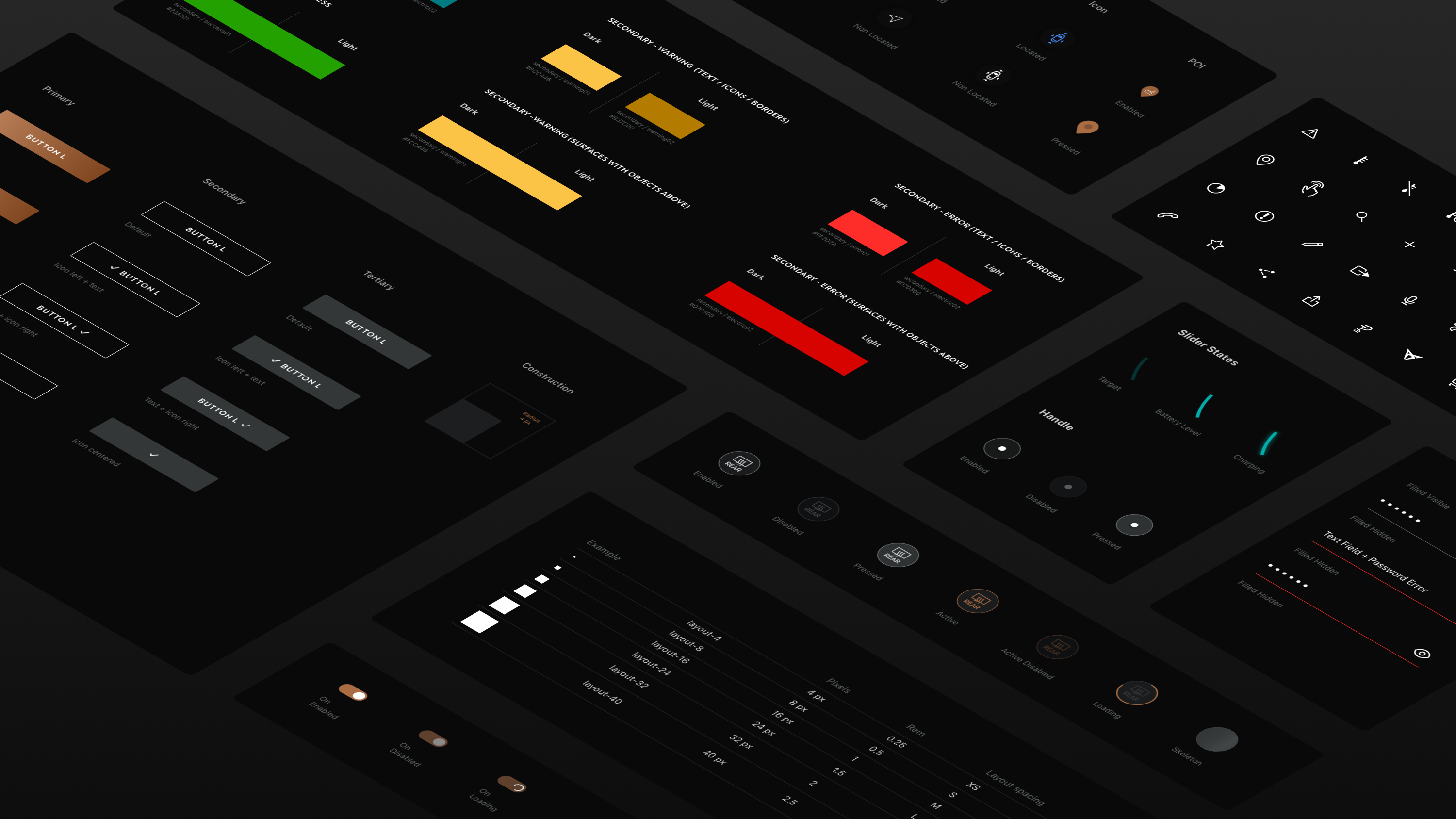
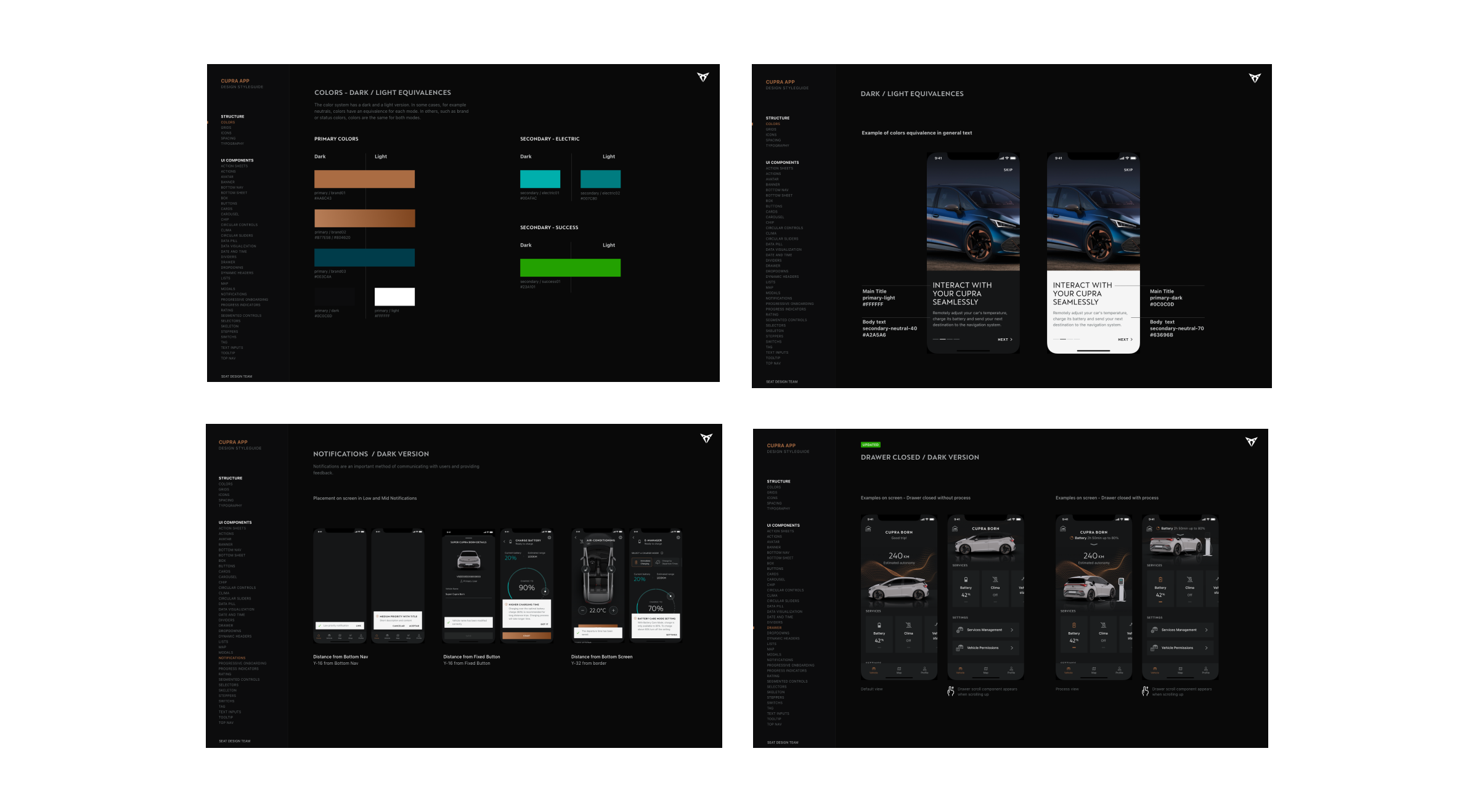
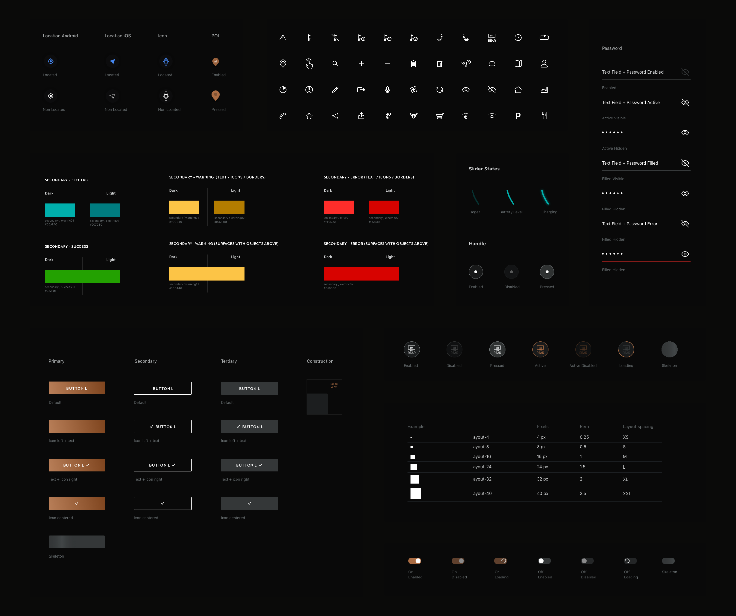
We define the design foundations that will allow the subsequent construction of the components.
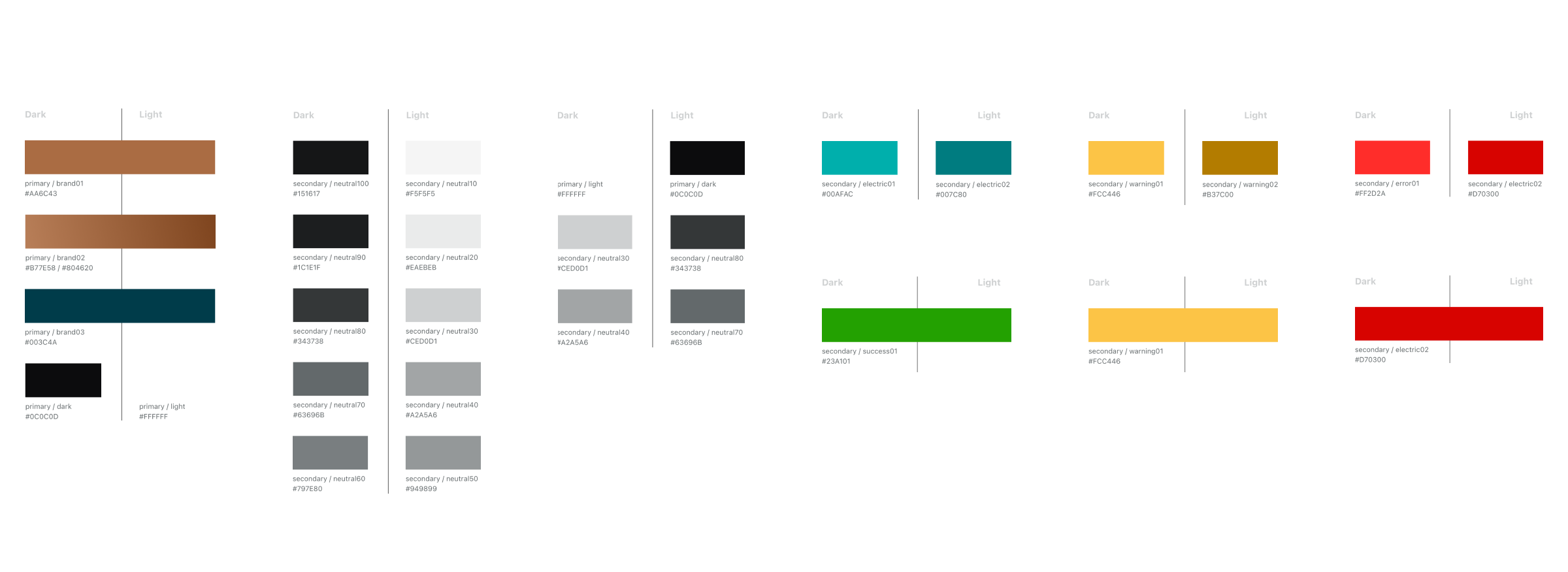
We defined a typographic system that would be easier to scale to a multi-brand design with:
System defined in base 8 with different measures (XS, S, M, L, XL, XXL)
Icons alignment work with other teams in the CUPRA / SEAT ecosystem.
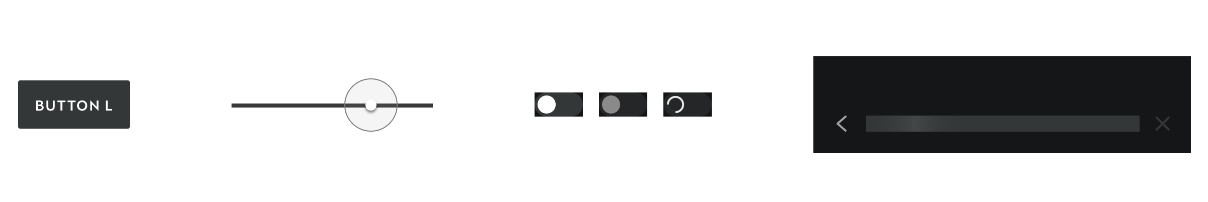
Construction of components considering the scalability and interaction:
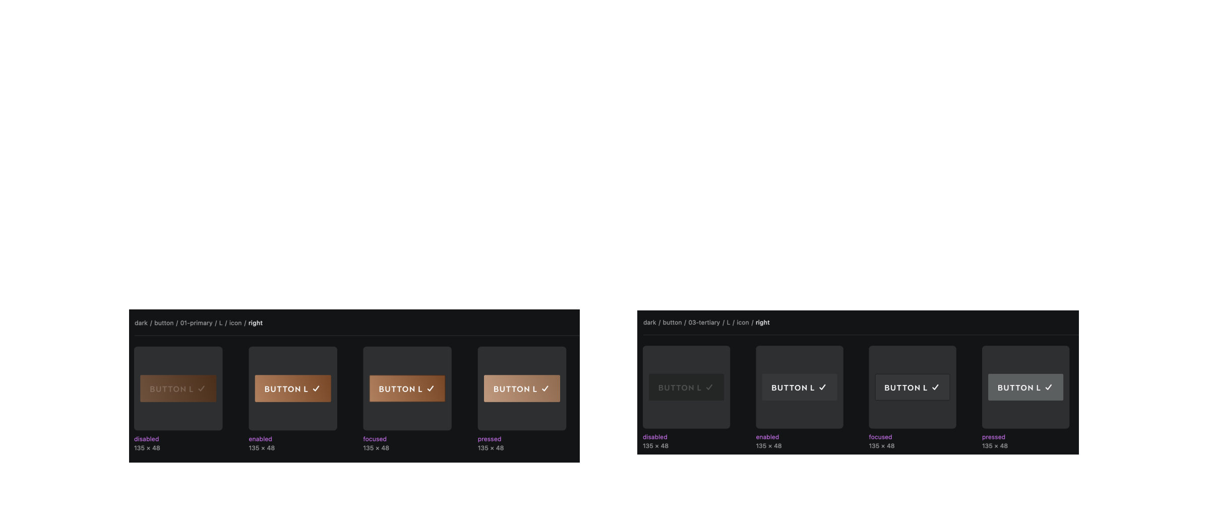
We created a document with detailed info about foundations and components with specifications, states, behaviors to facilitate both asset usage by new designers and the implementation by engineers.
Engineers created a repository available in pre production versions (in both platforms IOS and Android) to test all the components in live. Testing the components and their behavior facilitates the QA process and their reuse by development.
I have also contributed to guidelines construction for consistent processes and files structure with a remote team.
The design system has allowed us to scale the design of features adapted to different car models. In addition, a new team has started the design and implementation of the SEAT brand app, using the design system we have created as a base for the CUPRA brand.